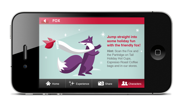
Starbucks Cup Magic
Starbucks Cup Magic is the company’s first major augmented reality app that brings holiday characters to life.
Working as a part of a Blast Radius team, Sandra was responsible for the user interface design. In addition, she offered support to the development team and insured accurate and effective implementation of design.
The app allows customers to animate holiday characters by pointing a smart phone’s camera at the coffee cups and other merchandise, offering surprise and delight to customers during the holiday season.
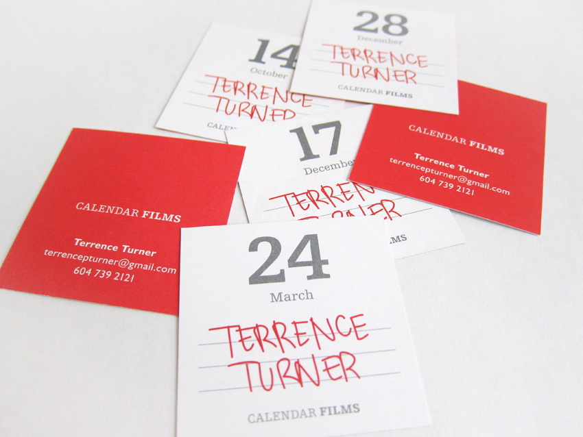
Calendar Films
Sandra was approached by a Vancouver based writer, filmmaker and producer, Terrence Turner to develop an identity for his company Calendar Films.
Taking inspiration from a traditional daily calendar, Sandra created an identity that is suggestive of the company’s name. Symbolic of a quickly marked calendar sheet, the business card has Terrence’s name executed in handwriting.
The distinct design echoes Terrence’s sharp-witted personality and communicates his unique approach to writing, directing and producing.
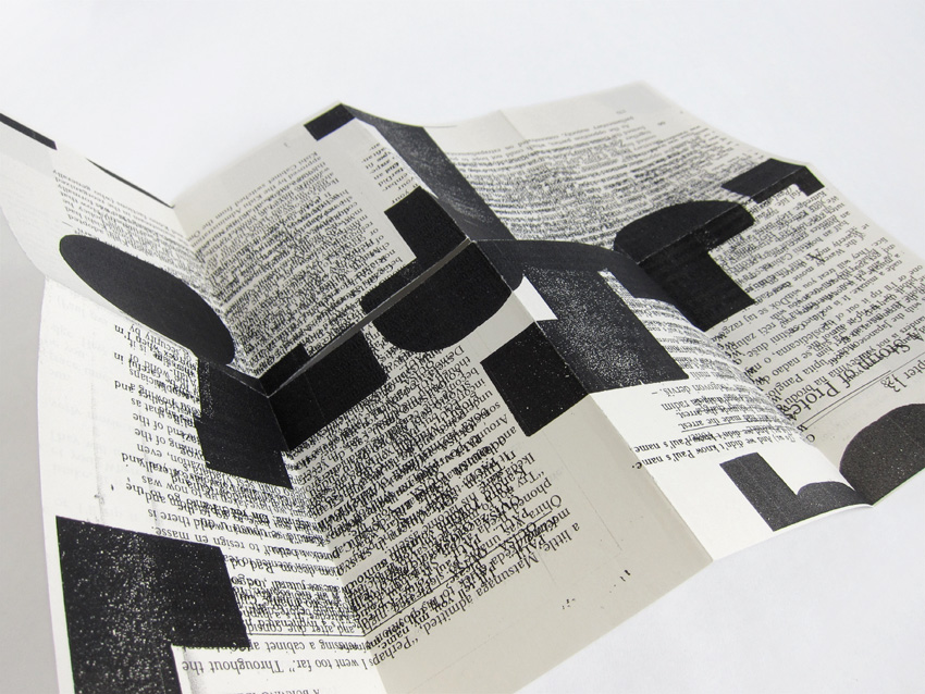
Typographic Zine
Typographic Zine is a visual experimentation that positions a designer as author.
The work explores the notion of altering content through the repetition of typographic elements and texts taken from various sources to make a whole. The visual effect comes from the interaction and overlapping of the texts and letterforms of wood block type.
Often no longer readable, the content is transformed into an abstract image. Produced on recycled pages from a book using the photocopier, the work exploits a single-sheet instant zine format. The final piece is packaged into a clear bag with handlettering on it.
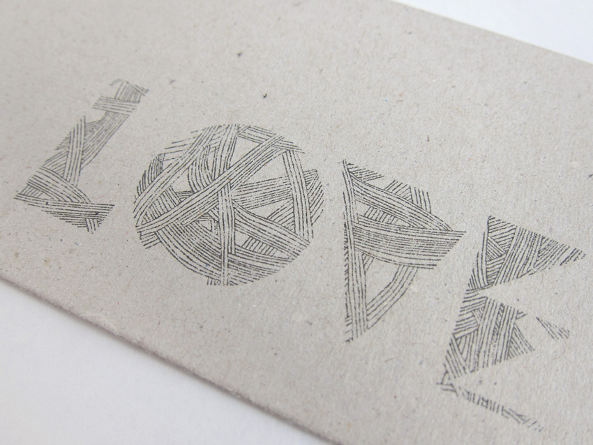
Handlettering
Typographic expressions.
In this typographic expression an intricate line drawing was transferred into digital medium and further manipulated to craft distinct letterforms.
The informal and artistic qualities of the drawing offer individual personality and contrast the precise forms they are contained in.
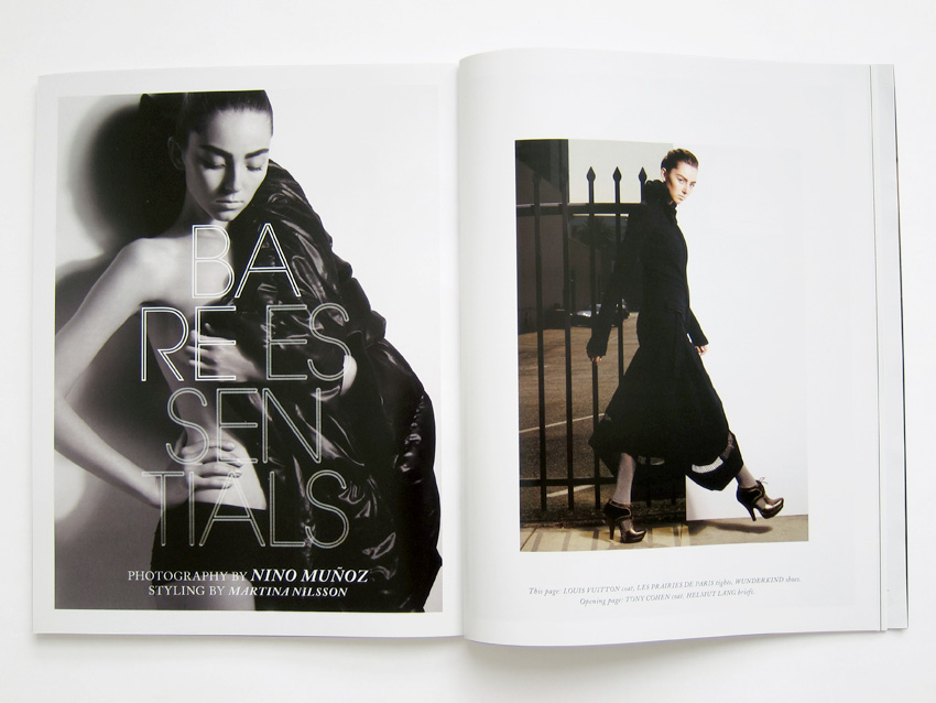
NUVO Magazine, Vol. 11, No. 3
Direction and design for a Canadian lifestyle publication dedicated to delivering stimulating, entertaining and informative editorial content to affluent, educated men and woman.
As Art Director of NUVO, Sandra has redefined publication’s visual style and established design principles that are consistent with the character of the magazine. The magazine needed to be straightforward and sophisticated, so the new design focused on the integration of white space, consistent design elements and clean pages, allowing the images to dominate when appropriate.
Refined application of type, creative use of white space and visually arresting imagery present an engaging editorial experience. The success of the redesign was reflected in the overall increase in advertising sales and has reestablished NUVO as one of the leading publications on the national market.
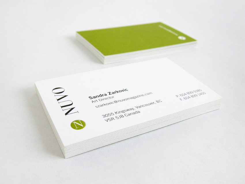
NUVO Magazine
As Art Director of NUVO, Sandra revitalized the magazine’s existing identity to express the new vision for the publication.
The simple yet memorable icon in the form of a monogram signals the modern and forward thinking nature of the publication, while the serif typeface used for the logotype lends a note of sophistication and elegance. In the magazine the icon is used to draw attention to the department labels and to mark the end of the article.
The new identity speaks directly to the target audience and effectively reflects the magazine’s new visual style. In addition to the identity, Sandra designed a full range of applications, including stationary, print collateral and marketing materials.
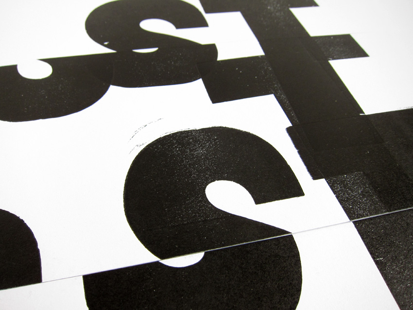
Broken Type
Broken type is a self-directed project that engages with the exploration of the artistic potential of letterpress.
The work focuses on the physical involvement with the process and emphasizes its imperfections. Blocks of type are deliberately printed either softly enough to show the texture of the character, or so forcefully that the paper is debossed.
Letterforms have been abstracted by way of making multiple passes through the press, where only a portion of type is printed in a single pass. Taking inspiration from visual poetry, a series of prints explore the ways in which typographic arrangements add or alter the meaning of words.
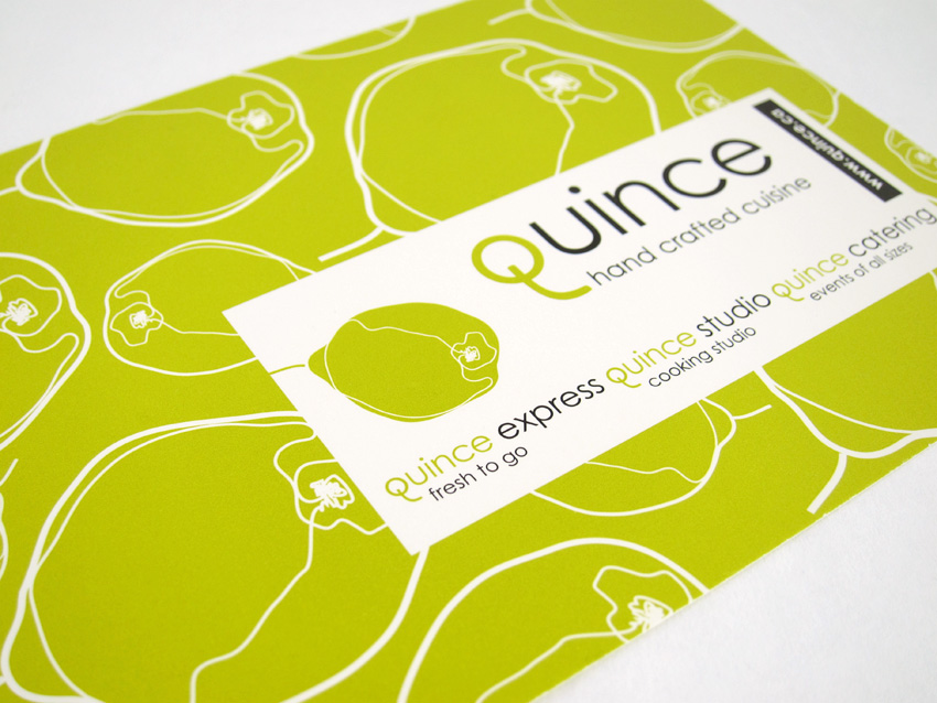
Quince Culinary
Vancouver based café, boutique food shop and cooking school, Quince Culinary is committed to the use of high quality local and sustainable ingredients with slow cooking methods to create a beautiful contemporary cuisine.
Sandra was asked to develop identity system that captures the company’s unique character. Her solution was a logotype with a distinctive letter “q”. As part of the identity system, a collection of line drawings was combined to create an elegant and eclectic series of patterns. The patterns were used in a variety of applications from labels and signage to the website, reflecting the company’s multifaceted nature.
The simple yet memorable identity speaks to the active, urban and upscale customer in a distinctive contemporary fashion and has helped Quince Culinary establish itself as an ultimate gourmet destination for any food enthusiast.